

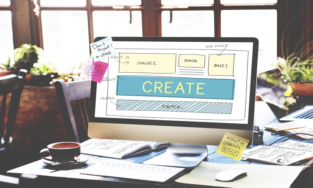
Seven seconds. That is roughly how long a visitor gives your homepage before deciding to scroll or close the tab. Not the polished hero video, not the stock photo of a handshake, not the tagline you spent a weekend arguing about. Seven seconds to figure out whether they are in the right place.
Most small business sites waste those seconds on a rotating carousel and a paragraph nobody reads. The fix is not a redesign. It is deciding, in writing, what a stranger needs to see before they trust you enough to keep going. That decision is the real work, and it usually happens long before anyone opens a design tool, which is why teams that care about the outcome start with agencies that treat Web Design Services in Ann Arbor, MI as a layout and messaging problem rather than a decoration exercise.
The first screen is a decision, not a canvas
Here is the stance I will defend: your first screen should answer three questions and nothing else. What is this? Who is it for? What do I do next? Every element that does not serve one of those three is costing you attention you cannot get back.
Designers love the first screen because it is the most visible surface on the whole site. That is exactly why it gets overloaded. Someone asks for a newsletter signup because the marketing plan says so. Someone else wants a promotional banner. A third person insists the mission statement appear above the fold. Six months later you have a hero area carrying four jobs and doing none of them well.
I would rather ship a plain headline and one button than a beautiful composition with no clear next step. Aesthetics matter, but they are the second question, not the first.
What the four-part first screen looks like
I use a simple structure with clients, and it holds up across industries. Four parts, in this order, stacked so a thumb can reach them on a phone.
- Outcome headline. One sentence naming the result you deliver, written in the customer’s words, not yours.
- Proof line. Something a stranger can verify in two seconds: a client name, a project count, a location, a service area.
- Primary action. One button. Not two, not a dropdown. If everything is clickable, nothing is.
- Orienting image. A photo of the actual work, the actual space, or the actual team. Not a stock couple laughing at a laptop.
That is the whole thing. If you build only this and stop, your site will outperform the majority of competitors in your market who are still cycling through banner slides.
Why the rotating carousel quietly fails
Homepage sliders persist because they feel like value. You get three messages for the price of one. In practice, visitors see the first slide and click before the second rotates in, so slides two and three are decoration for people who already left. Research from the Nielsen Norman Group has documented this pattern for years, and anyone who has watched a session recording has seen it happen.
My rule: if a message deserves a slide, it deserves its own section further down the page where a motivated reader will actually find it. The first screen should carry one message, delivered clearly.
A quick audit you can run this afternoon
No tools required beyond your own phone and a stopwatch. This is the checklist I hand to clients before we touch a single layout file.
- Open your homepage on a phone held at arm’s length. Cover everything below the first screen with your hand.
- Give yourself three seconds. Can you say what the business sells, out loud, without scrolling?
- Look for the primary button. Count how many competing calls to action sit at the same visual weight.
- Read the headline. If it could describe three competitors, rewrite it until it could only describe you.
- Check the proof line. If there is nothing concrete, add one real detail this week.
- Ask someone outside the business to do steps one through five cold, and write down exactly what they say.
Step six is the one people skip. Your own eyes stop seeing the page after the third revision. A fresh reader will tell you in ten words what your copy could not say in forty.
Accessibility is not a compliance box on the first screen
Contrast, tap target size, readable type and a clear heading order are the difference between a visitor staying and a visitor bouncing because the page fought them. The World Wide Web Consortium publishes the accessibility guidelines that define these baselines, and the practical takeaway is dull but useful: high contrast text, buttons wide enough to tap with a thumb, and headings that make sense read aloud by a screen reader.
Here is the part that surprises clients. Accessible first screens tend to load faster and read cleaner for everyone, because the discipline that makes a page usable for assistive tech also strips out clutter. You are not doing extra work. You are doing the work once, properly.
Testing before you commit
You do not need a research budget to settle arguments about your first screen. You need five people. Show them the page for five seconds, close it, and ask what they remember. If they recall the wrong thing, your hierarchy is off. If they recall nothing, your headline failed.
Government digital teams have spent years publishing usability guidance for exactly this reason, and the plain language and clear-action principles in the U.S. General Services Administration resources translate directly to a small business homepage. Short sentences. One action. Plain words. Nothing clever.
A concrete scenario from a recent project: a regional services firm had a homepage hero promising partnership, innovation and trust. We swapped it for one line naming the service, the county it serves, and a button labeled with the actual next step. The client hated it at first because it felt too plain. Two weeks later they stopped arguing, because the phone started ringing during business hours instead of just filling out forms at night.
Ship the plain version first
Your first screen has one job, and you can measure whether it is doing that job by watching how many visitors take the primary action. Everything else on the page exists to support the people who finish reading the first screen and want more.
So build the four-part version. Cut the carousel. Replace the stock photo with something real. Run the six-step audit on your own phone before the week ends, and write down what a stranger says when you ask them what your business does. Their answer is your next design brief.
